The Blue Zoo Process: Part 3 | Laying the Foundation

The Blue Zoo Process: Part 3 | Laying the Foundation
Sitemaps and Wireframes
We know this is the riveting article for which you’ve been waiting! This is the part where we tell you about how we do all the work before we do the work. We compare it to the work done for building a house that an architect creates as well as the landscape designer and interior designer. Planning makes the end product something you hoped for so when the construction is complete, it is delivered as expected. No one wants to see their kitchen sink in the middle of the front yard, after all.
Note: This article is mostly for web design, but similar work is done when working on printed materials, such as annual reports, magazines, books, and even marketing campaigns.
Sitemap
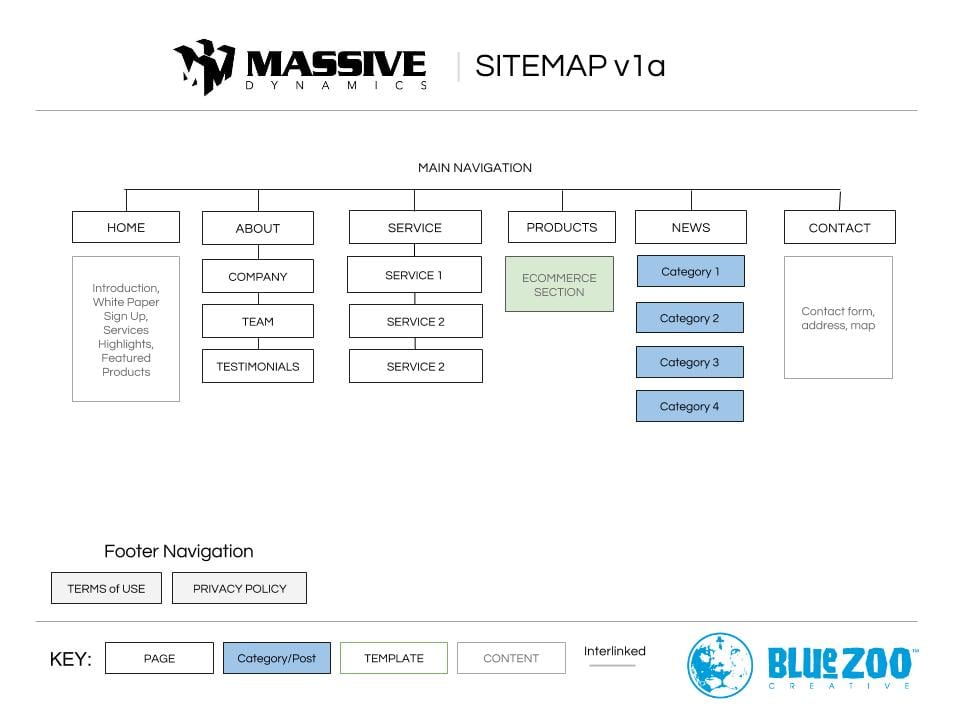
The sitemap comes out of the collaborative meeting with you and is a map of all the content; where it’s going to go, what’s most important, what kind of page, post or product will it be. We organize the sitemap based on your business goals and how we want to present to your clients to make sure you become part of their story. An example sitemap is below. (right click on image for larger view)

Wireframes
Wireframes are the next stage in building the foundation. While this is still a step away from a design, we bring in our selected designer to help brainstorm and build the wireframe. At this phase, it is simply organizing where content will be displayed; images, copy, links, forms, maps, charts, etc. This is the floorplan of the website.
With the sitemap created and approved, we collaboratively review the pages to see if the individual designs may overlap. While the home page will most usually be unique, some of the other pages may follow a similar layout and flow. An example for pages with general information might be the About, Company, and Services 1-3 pages. But the Team, Testimonials, Contact and Products pages would each need their own page layout. Usability studies say that creating different designs for each page of a website can be difficult for a visitor to have to learn where information will be displayed.
At this point, in the case of the example sitemap above, we might come up with ten (10) wireframes.
- Home
- Top Level (About and Services)
- General Information
- Team
- Testimonials
- Products Overview
- Product Detail
- News
- News Article
- Contact
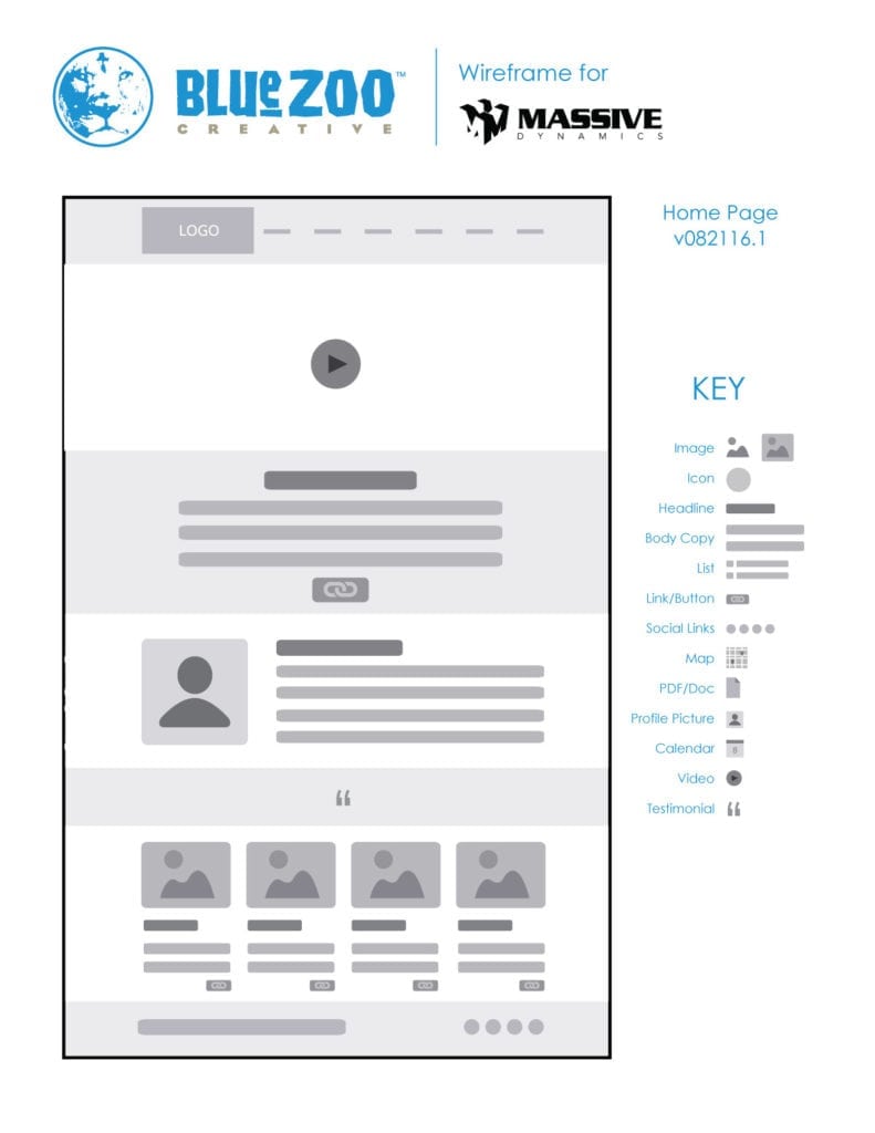
 The resulting wireframe for the Home page would then look something like this with the following structure (click for larger image):
- Logo and Main Navigation
- Video introduction as collaboratively discussed
- Text overview of company (for those who may skip the video)
- Message from Key Stakeholder or CEO sharing company promise
- Testimonial(s) section
- Latest news
By specifying specific content for the structure, we can take into consideration less content or more content. An example being the company would like to show more news articles on their home page than just four. The content may expand, but the structure will not.
Concluding the Foundation Plans
Before we show all the pages to be approved, we take one more step to ensure the ‘construction’ will be smooth: we pass the wireframes to the website developer on the project. The developer ensures what we’ve designed for our client is actually achievable in a real application. Once they approve, we send it to you, the client for sign-off.
From there, the designer works their magic blending art, copy and principles of design, color psychology and usability studies to create a design that encourages someone, somewhere to do something on your website.
Next up… the Elements of Design.


