 ‘Above the Fold’ isn’t important?
Have I lost my mind?
Friends and clients keep asking for design changes because they’ve heard something about ‘above the fold’ like: “Isn’t it important to design everything ‘above the fold?’ We’ve heard 80% of the people don’t scroll! We need everything to show up on the first screen.” Generally, I laugh at these anachronistic ideas that harken back to the heydays of newsprint.
What? Newspapers? Folds?
If we’re going to take lessons from newsprint, let’s look at all the research and not make blanket statements without having the facts.
Here is some background on newspapers and above the fold.
While Jakob Nielsen, website usability expert, is generally the source of this information, he never said web site visitors do NOT scroll. The summary of the research was, “Web users spend 80% of their time looking at information above the page fold. Although users do scroll, they allocate only 20% of their attention below the fold.” His research is NOT saying to cram all your content into that Golden Web Real Estate known as ‘Above the Fold.’ This would be the equivalent of taking everything in your store and putting it on the curb, along with painting every sales price on the doors and windows, just in case someone passing by might not come in your store.
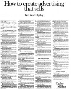
 I pull my REAL newsprint information and research from David Ogilvy. He is one of the esteemed founders of the advertising agency Ogilvy & Mather and known as the “Father of Advertising.” He did research on such things as eye strain by readers of newspapers (better black on white vs white on black). I have followed, and taught, Ogilvy’s tried-and-true-methods with great results. If you’re really interested, click here for our previous post of “How to Create Advertising that Sells” from the Wall Street Journal on June 14th, 1972. It astounds me how many companies ignore the research of the past, set up new studies, and find the same results.
The bottom line is do not put everything above the fold. Many websites have obtained higher conversions by putting sign-ups, actions, and buy now buttons at the BOTTOM of the page.
Breath. It will be okay.
Study after study shows that having a “Call to Action” below the fold yields a higher conversion rate.
What Nielsen’s research says, and Ogilvy’s before him, is that if your content ‘Above the Fold’ is engaging and what the visitor is looking for, then the sky is the limit. And that GOLDEN 20% will scroll, read and, more than likely, contact you or buy on the spot!
Keep all this information in mind when people give you advice to cram everything into the top of your home page. Also, keep in mind that Google did change their algorithm last year to target content ‘above the fold’ as an attempt to make sure there is relevant content and not simply affiliate ads.
Which brings me to the whole point about ‘Above the Fold.’
One main factor will get people to scroll, click, call, or buy. Is the visitor motivated by what you are selling?
Focus on improving that message, image, or offer and your business will grow.
Quit Monkeying Around, Get Focused Today with the Zoo!
________________
Sources:
Scrolling and Attention @ Nielsen Norman Group
by Jakob Nielsen
Google Updates Above the Fold Page Layout Algorithm @ SearchEngineWatch.com
by Miranda Miller, October 10, 2012
Designing A Website Above the Fold Infographic @ creattica.com
5 Things Your Website MUST Feature “Above the Fold” @ blog.hostbaby.com
by Chris Robley
Why “The Fold” is a Myth – And Where to Actually Put Your Calls to Action @ blog.KISSmetrics.com
by Bnonn
When Best Practices Fail @ CertifiedKnowledge.org
by Brad Geddes
