Navigation Trends: Hamburgers, Waffles and Breadcrumbs

Navigation Trends: Hamburgers, Waffles and Breadcrumbs
Were Ancient Egyptian hieroglyphic symbols from an advanced civilization that had switched to icons for communication?
Language can be a barrier in our world today, while images are able to communicate volumes. Those with the most influence are now able to set the standards of these symbols. With nearly as many mobile subscriptions as there are people in the world, it’s no wonder online navigation has taken on a new look.
How Did Food Get in My
Website and Digital Apps?
We originally found our food as hunter/gatherers. Now, we find and consume our information in much the same way. From the physical to the digital, we scan for what we need, hone in, or move on.
When Apple first released the iPhone, it gave us a mobile device with 20 icons to quickly access the resources we valued most, like email, weather, stocks, calendar, and, of course, the iPhone icons. It’s a very effective way to visually find the tools we need. Over time, we’ve created so many Apps that visual clutter has caused us to group apps or move them to different screens.
Just a few short years ago, websites had a layout of 800×600 pixels. Your desktop (or maybe laptop) computer had a very specific limitation. Usability studies from researchers like Jakob Nielsen suggest keeping navigation uniform and recognizable. A book by Steve Krug, Don’t Make Me Think, echoes the idea that you want to keep web navigation simple.
In the early 2000s, the use of Flash encouraged designs where creativity trumped simplicity in navigation. Everyone had their own ideas for what symbols to use for navigation. “Home” might be a house, door, doorknob, doorbell, or office building. Visitors had to search and think too much, bogging down site navigation.

Today, with websites viewed on mobile devices, Retina Displays, HDTVs, and more, it’s even more important to keep things simple. Apple, Google, and other large companies are leading the design aspects because their massive exposure can set the trends. Luckily, most of their designs are useful.
While following the leader is not always the best decision, you can see what is trending to decide whether to follow or create your own path. The rise of sliding images on website home pages or using video backgrounds to be more engaging is a current trend that many clients find useful.
Make sure the leaders you follow have a proven track record reaching goals until you learn enough to become a leader yourself.
~ Eric Huber
Understanding Navigation Trends with Food Terms
Breadcrumbs
This is a much older reference in web design. It describes the effect of showing a path that has lead a visitor to the current page. For this blog post on Blue Zoo, the breadcrumb path would be:
Home > Blog > Team Tip > Blog Post
This sort of navigation is still useful, especially in eCommerce websites, but it is not as prevalent as it used to be, as sites now have built-in search functions. When sites were more static, this would have involved additional programming and cost.
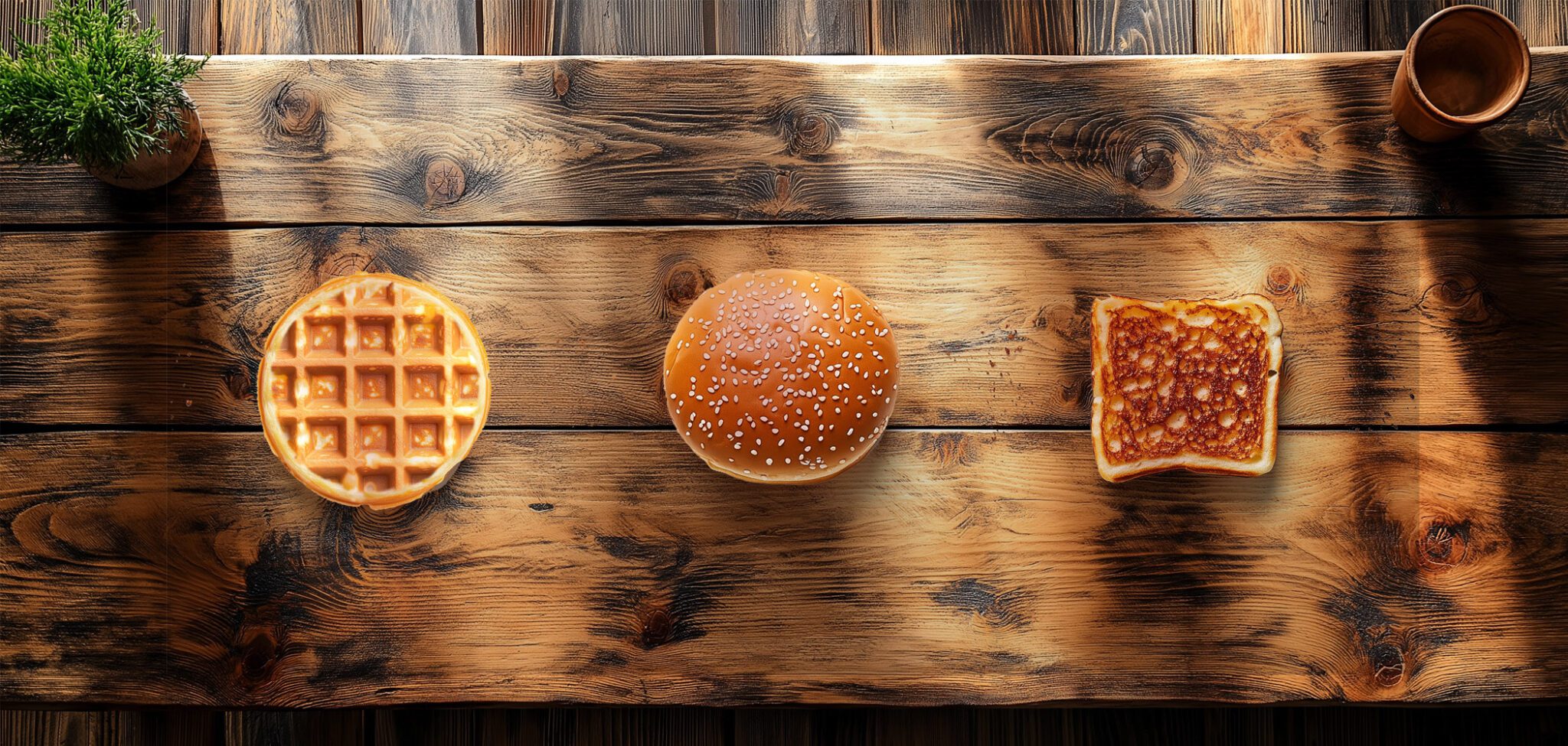
The Hamburger
These three stacked lines are referred to as a Hamburger Menu, Hamburger Drawer, or Hamburger Sidebar. It’s used to tell users a menu is available. Some say it’s from an app first used on the iPad, but most in the UI (User Interface) community refer to it as a Facebook Menu Drawer. Interestingly, Google refers to it as a Navigation Hot Dog.
The Waffle
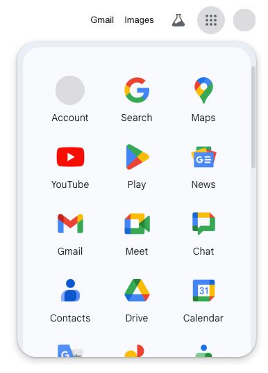
This Menu Grid is actually an offshoot of Google’s Mobile App navigation. A few weeks ago, the Black Bar disappeared from my Gmail account. I was momentarily lost but looked for new items and discovered this little black ‘waffle,’ as I’ve named it. When I clicked on the Waffle, a pop-up window opened with a slew of icons, all of which I recognized from my iPhone. With this Waffle, Google replaced navigation on many of its sites and in its web browser, Chrome.
As a designer, I like minimizing extraneous elements and presenting useful information, solutions, and action. Moving the navigation to a corner of a website allows for a more impactful visual impression.
As a leader in search, innovation, and mobile, Google may have created a hot new navigation trend. However, the true test is whether the website visitor ‘gets it.’ Using the Waffle design, sites might lose potential clients who don’t see the small Navigation Waffle and leave the site instead of buying.
I believe the Navigation Waffle will stick. If you decide to try this for yourself or your clients, tread carefully and watch your analytics.


Stay tuned for an upcoming series of articles on Designing from the Past.
It will cover lessons from past masters, in various fields, that can help you build your Online Presence for the future. Until then, I’m off to get something to eat!
SOURCES:


