Content Blog #3: Invisible Content

Content Blog #3: Invisible Content
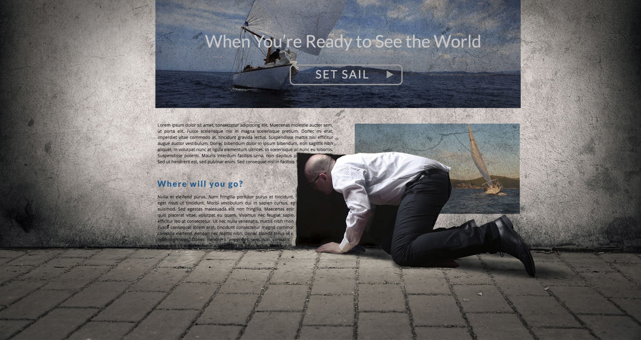
In our last post in our series on content, we discussed the surprising number of places content is “hiding” on your website. Today we’re going to address what we call “invisible content,” which is the content that hardly anyone thinks about, but that dramatically affects your audience’s experience of your website.
Let’s start by thinking about a single button on Blue Zoo Creative’s website, one that you see on every page. It’s large, round, and pulsing. It is bright blue, with a tangram on it, and large white words that read “GET CREATIVE.” When you click on this button, you go to a page that explains how to get involved with Blue Zoo Creative, and you have the option to fill out a questionnaire for your project.
On an ordinary website, that button might be in a menu at the top of a page, or a small button at the bottom of the homepage. It might be grey or black. It would probably say “Get started” or “Learn more.” But that’s boring! And you aren’t boring, are you?
On your website, that button might lead to a questionnaire, or it might lead to a contact page, product description, or list of services. It’s the call to action button that gives your website visitors the key to get involved in whatever it is you do. Your call to action button needs to be interesting! Let’s go back to our call to action button: ours says “Get creative.” Everyone wants to be creative, right? We took hold of the word “creative” as one of the key things that makes us unique, and we based our call to action button around that idea. Our “Get creative” button offers people the chance to make their creative dreams a reality. It draws people in.
How could you draw people in with your call to action button? Start by thinking about what makes your company or product or organization special. Pick one word or idea, and create a short way to draw people into that idea. If your idea is “dream big,” then your call to action button could read “Dream big with us.” If your word is “solution,” then your call to action button could read “Need solutions?”
This simple method can be used for every single place words are found on your website. As you apply this method, your own uniqueness and creativity seeps into every corner of your website, and every person who visits your website will see it and feel it! Don’t settle for an ordinary “About” page or sidebars. Get creative with your “invisible content.” This is one valuable way to set yourself apart from your competitors!
If you’re still not sure about what we mean, here are some of our favorite examples of well-written “invisible content”:
- Greatist’s menu words and their About page: they value helping their readers better their lives, so all their menu and keywords are focused on YOU.
- Our own contact page: pretty great, right?
- Corporate Yoga Muse’s “About CYM Group” page: Pay special attention to the order of information and their strong word choices!
- Jim Karrh’s menu word “Insight,” which he uses to market his own book. “Insights” sounds a lot better than “Buy My Book,” right?
- Specialized Real Estate Group’s “Communities” page: Their menu item “Communities” takes you to an interactive list of their properties. Would you prefer to live in a “property” or a “community”? One of SREG’s core values is building community, so they incorporated this into their “invisible content” in their menu.
We hope we’ve shown you how important “invisible content” is to how your readers perceive your business. If you’re still a little iffy on the concept, don’t worry—we have amazing, creative content specialists who will be happy to help you write all your content, whether invisible or not.
Join us in our next post as we look at a more obvious form of content, a blog or news page. We’ll explain how regular posting can boost your business, as well as all the different ways you can use a blog to highlight how awesome your business is!


