3 Ways to Make Your Logo Pop!

3 Ways to Make Your Logo Pop!
Article updated August 24, 2018 from the original post on April 12, 2011.
In my more than 30 years in design, I’ve seen a lot of great logos and seen a lot of bad ones. I’ve created a lot of good ones and a few bad ones in my day as well.
One of the most requested design direction I’ve received was “Can you make it … pop?”
If you are requesting that a graphic designer help you achieve this, you may see their eye twitch. The reason is, we need more direction. The immediate idea is that you, as a client, want it to stand out more in some way or another. A great designer will have asked many questions, looked at your ideal customer, and compare you against your competitors in order to create a logo that stands out in your particular niche. Before you begin, give a designer examples of what you consider really ‘pops.’ Is it the color? The font (typography)? Is there an image/icon that catches your eye? Keep in mind, while it is important for you, as the client, to feel good about your company logo, it’s the customer that needs to be drawn to you to solve their problem.
But let’s dive in a little deeper.
Why Does One Logo Stick in People’s Minds
and Another Fade into Obscurity?

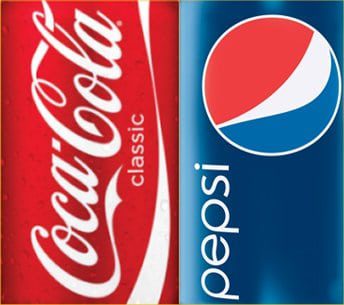
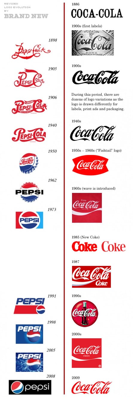
Coca-Cola has been around since 1885 and Pepsi-Cola since 1903 (although originally started as Brad’s Drink in 1898) (source: wikipedia.org). Now, I originally shared that Coca-Cola has never changed their logo (see image below) although they did go by just “Coke” on some products. Pepsi, however, has changed it numerous times. Why? Looking at the history of their logo, it appears they were copying Coca-Cola’s style for a while as well as what the current trends were at the time. More recently, they are setting up their brand to be completely different. This is a much better idea in the long run.
The update here is that further research shows that Coca-Cola did change their logo, but as a designer, I will still say that it was less a change and more of the fact that without digital files, variations occur. Nearly all signs were hand-painted, and art departments often relied on artists to recreate logos. (see additional image below).
Back to the original question, though: Why does one logo stick and one fade?
Part of the answer lies in the fundamentals of logo design.


The Fundamentals
If you really want to make your logo pop, you’ve got to start with the basics.
- Keep it simple. A logo with an icon should be instantly recognizable and not make the viewer wonder what they are looking at. Keep your business name easy to read. This, by itself, can help that logo pop!
- Make it scalable. From a social media icon to a billboard on the side of the highway, the logo should still be identifiable. Not sure if it’s scalable as a designer? Squint when you look at the screen and see if you can still recognize what you’re looking at. A photograph is not scalable unless you start at the billboard size. Even then, just… don’t.
- Is it memorable? This can be a challenge, but the Coca-Cola example with its script and handwritten style design makes it memorable. Same as the Nike swoosh, the Apple with the bite out (no matter the color used), and the McDonald’s golden arches. A medical practice with a caduceus will not be memorable.
- Ensure it’s versatile. By now, it’s already scalable, which makes it a bit versatile, but what you want to ensure is that you can use it on t-shirts, letterhead, business cards, web, magazines, ads, and more. Also, consider it may be used as a one-color, spot-color, full-color, or even reversed.
- Be relevant. This is all about visually communicating what you do quickly. Don’t make the customer think. Make sure it relates to what you do or sell. If you sell coffee, don’t use a fishbowl…unless you are called Fishbowl Coffee (which is a whole different conversation about why you would ever do that.)

Ready?
3 Tips to Make Your Logo Pop!
To simplify, use these strategies to make your logo pop:
- Make sure it stands alone as a simple black and white image. It can be just a typeface. I can have graphics or cartoons. It can simply be an image or icon. But be sure it can stand alone as black and white and NOT shades of gray. This is optimal for reproduction in any medium, from a newspaper to yearbooks and from t-shirts to websites. You can add color as you create your brand, but be sure to review the psychology of color (one source of many) to see what would project your business best.
- Use imagery. But use imagery that is either a) eye-catching, b) representative of your business (i.e. a podium for speakers), or c) reflection of you or your services (i.e. if you are known for your tie, use a tie in the logo… but be sure that your staff uses ties).
- Use typography that isn’t common AND modify it in some way. For example, DON’T simply use Comic Sans, web fonts, or whatever came with your computer and leave it as that in your design. And make sure you do something unique with the type, such as extend the leg of a ‘y’ or perhaps make the cross of a ‘t’ extend out farther. Some will bring letters closer together (kerning) or even connect them like two letter “o’s” could be linked and produce a unique new form.
These three simple strategies will make your logo ‘pop’ from other businesses.

Sample Logos by
Blue Zoo Creative
that ‘POP!’


